mileus/ui

I decided to build React component library for Mileus' web projects because we were building multiple web applications based on same stack.

It was important to have consistent look across them and I also wanted to be more productive by working on business requirements instead of reinventing basic UI components each time. The result was this library that was distributed as NPM package.
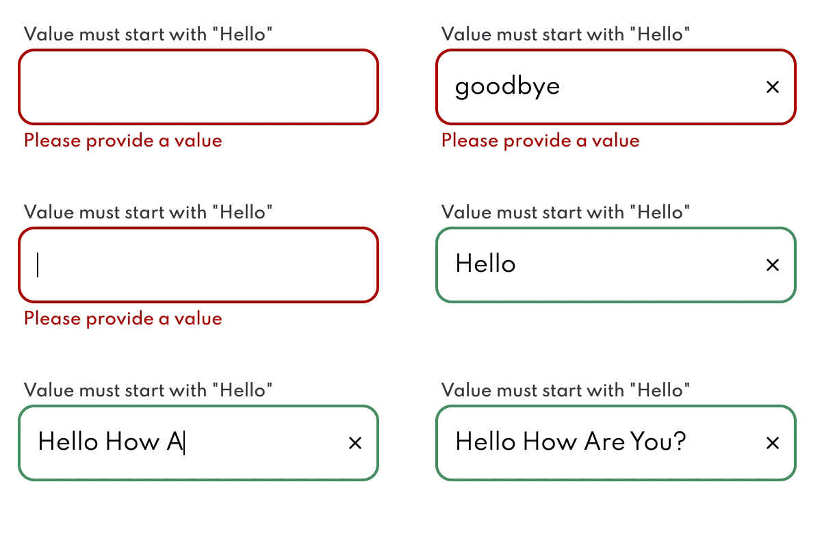
Text input componentText input component with validation.
Text input component with validation.
Button toggle componentToggle button component composed from base buttons.
Toggle button component composed from base buttons.
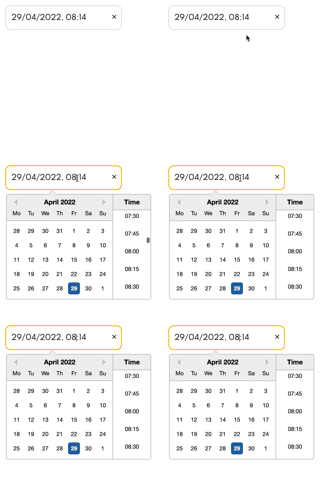
Datetime input componentCombined date time input component which is locale aware.
Combined date time input component which is locale aware.

The library is heavily opinionated which means it comes with its own stylesheet and typography to maintain brand identity.

These are just some components that the library uses:

  • accordion header
  • autocomplete combobox that fetches options dynamically
  • buttons
  • date and time input that can be combined to enter both
  • icon set
  • configurable tooltip based on PopperJS
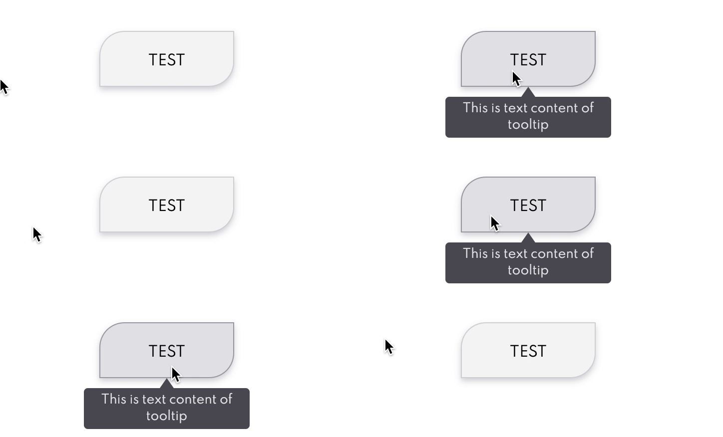
Tooltip componentTooltip applied to button, triggers on hover or focus. Tooltip can automatically switch its location if it detects window boundaries.
Tooltip applied to button, triggers on hover or focus. Tooltip can automatically switch its location if it detects window boundaries.
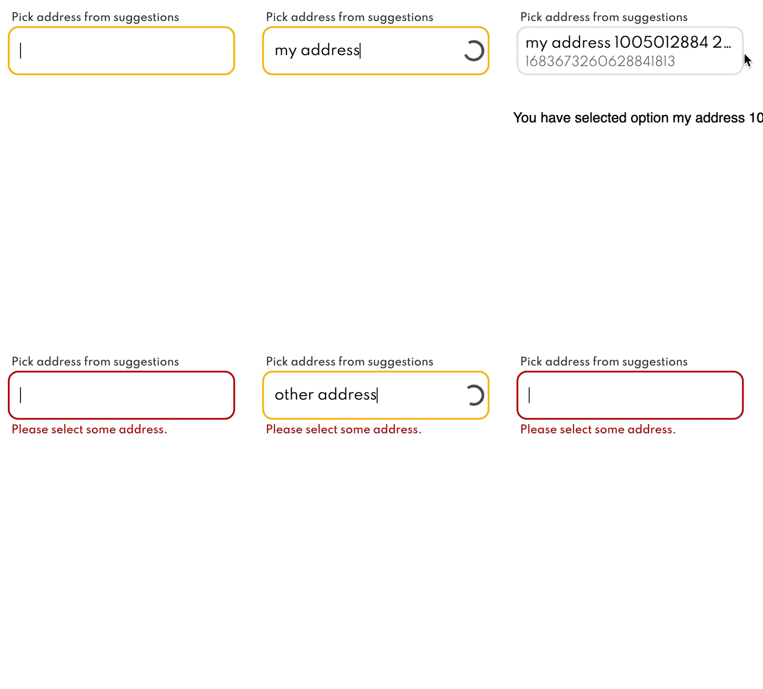
Address comboboxAddress combobox component which automatically fetches options from server. It uses portal so option list is always visible even when the input is placed in container with hidden overflow.
Address combobox component which automatically fetches options from server. It uses portal so option list is always visible even when the input is placed in container with hidden overflow.
IconsIcons specific to Mileus' business domain.
Icons specific to Mileus' business domain.

Apart from React components the library also exports series of CSS variables used for consistency such as

  • responsive breakpoints
  • margin and padding
  • colors
  • typographical sizes and weights
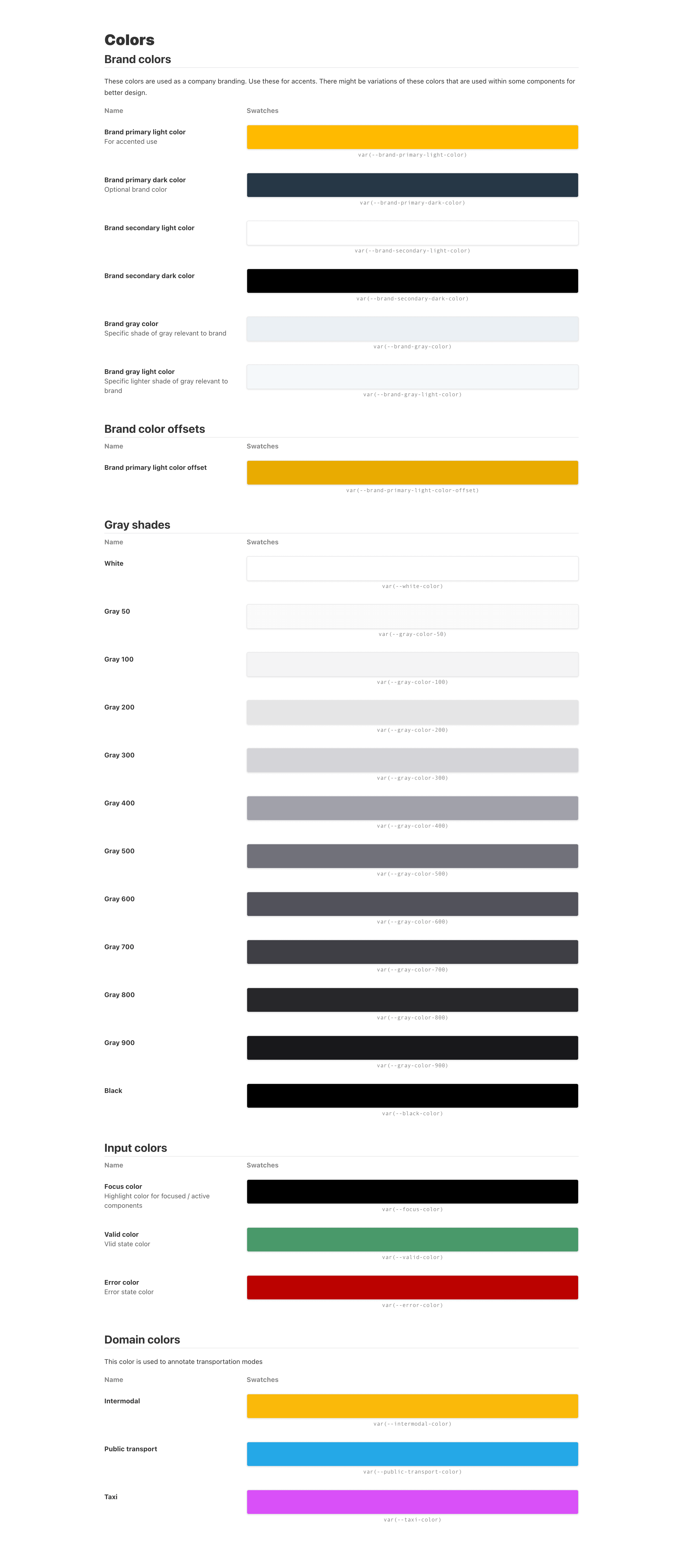
ColorsColors used for components and exposed as CSS variables
Colors used for components and exposed as CSS variables
SpacingSet of CSS variables for margin and padding used for components. These are also exposed and can be used to implement consistent spacing - inspired by Tailwind CSS.
Set of CSS variables for margin and padding used for components. These are also exposed and can be used to implement consistent spacing - inspired by Tailwind CSS.
TypographyTypography used for components and exposed CSS variables for sizes and weights. Used font is a variable font so supported browsers save bandwith.
Typography used for components and exposed CSS variables for sizes and weights. Used font is a variable font so supported browsers save bandwith.

Thanks to PostCSS it was possible to use breakpoint CSS variables in target projects.

It was very important to me not to have huge size of the library. The library has separate entry point and bundles for date time component as it requires date-fns library. This means that you don't pay the upfront cost of downloading it if you're only using button component for example.

All components are accessible via keyboard with correct focus behaviour.

The repository itself also contains Storybook to preview and test the components. This approach turned out to be a good decision since designer could check his work and try out different states of the components.

↩︎ Go back